Internal review

Review the three homepage designs.

All three designs serve the same page, and the wording is identical across them at 55 text blocks each. The choice is about the layout.

Palette and type come from the mood board. The page order follows the landing pattern from the ui-ux-pro-max skill: what it is, then proof, then how it works, then the ask. The rationale document explains each design in full and lists the two rule sets both were held to.

The mood board itself is on this site, and it is the source of the palette, the type and the proportions. Open the mood board.

Navigation follows your page list: About, Product, Solution, Contact, then Get a Brief as the one action. Every link points at # for now.

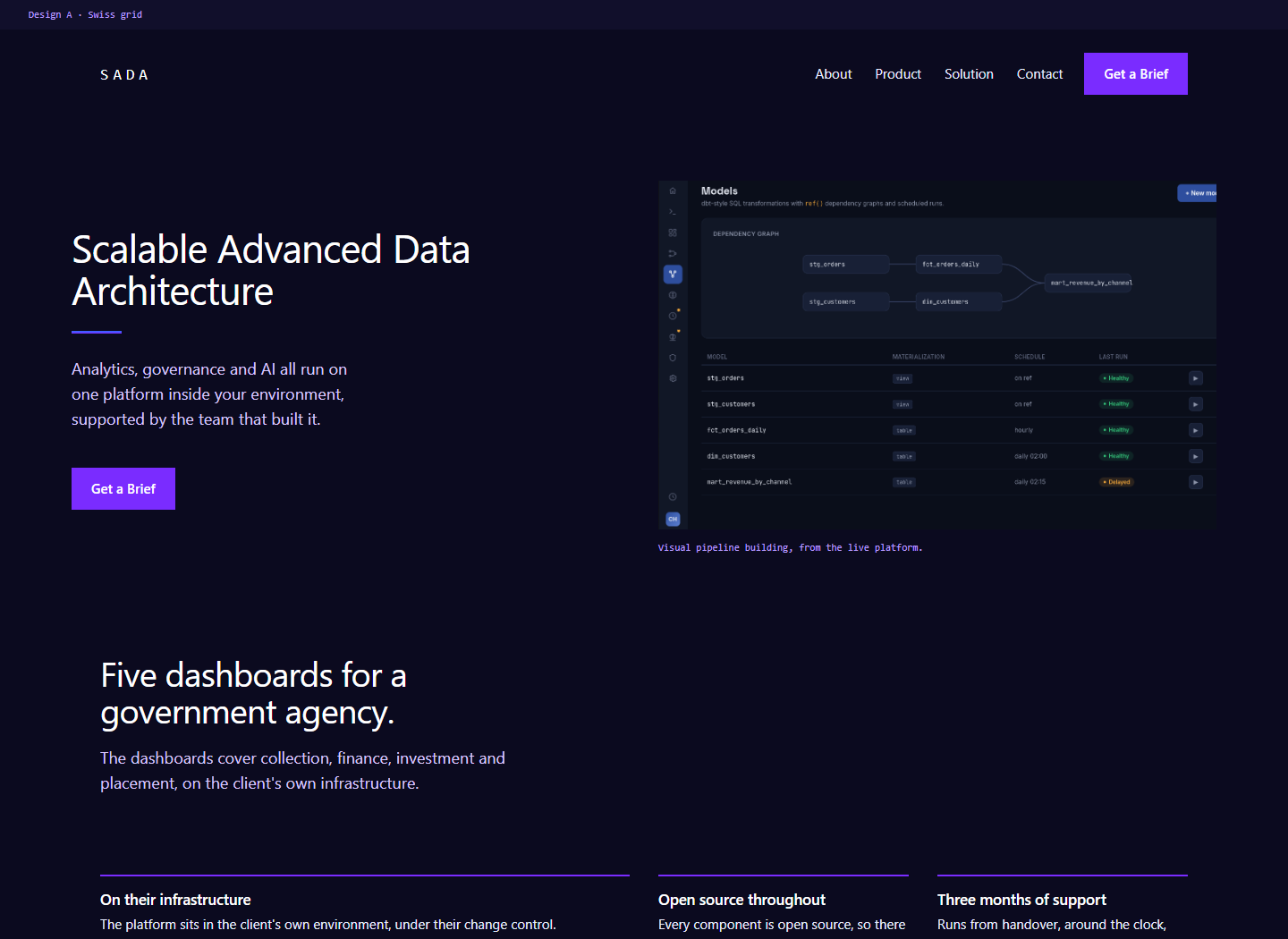
Swiss grid design, twelve column layout with the headline at the left and a platform screenshot at the right.

Design A

Swiss grid

This design uses a strict twelve column grid on an 8px spacing rhythm, with one accent and no decoration. Hierarchy comes from the gap between the heading size and the body size. The proof facts sit in a ruled row, the deployment points run as a definition list beside a screenshot, and the page closes on a plain band.

It suits a reader who compares options on paper and reads the detail before the summary.
Open design A

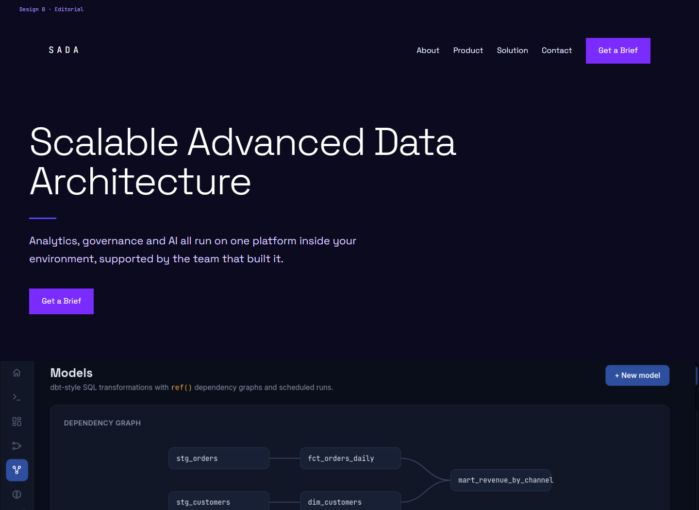
Editorial design, large headline above a full width screenshot running edge to edge.

Design B

Editorial

This design leads with type and puts the picture underneath, so the hero carries words only. Sections open at very large headings, the proof facts step further right in sequence, and the evidence runs as full width spreads and paired frames. Every separation on the page is white space.

It suits a reader being walked through the argument in a meeting.
Open design B

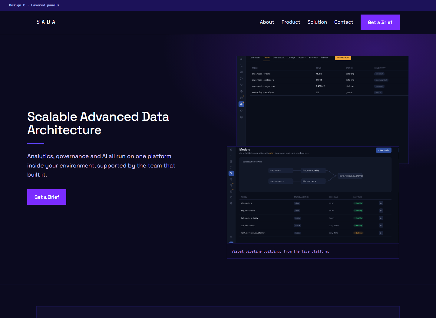
Layered design, two overlapping screenshots beside the headline on a deep ground.

Design C

Layered panels

This design builds the page from raised panels, with a border on everything and two overlapping screenshots in the hero. The proof facts sit inside a closed panel, the product points are bordered blocks carrying one gradient, and the evidence becomes a mosaic of two large plates and three small ones. The page closes on a full width colour bar.

It suits a reader who wants to see the product itself.

Open design C

What stays the same

  • The whole copy set, 55 text blocks, verified identical by extracting the visible text and comparing the sets.
  • Navigation, and the single action label, Get a Brief.
  • Colours, taken only from the mood board, checked by extracting every hex and rgba triplet.
  • Type, sharp corners, and the dark ground throughout.
  • Eight real screenshots, used once each per page, every one with alt text.

What changes

  • The grid: twelve columns, an offset column, or a panel system.
  • The heading scale, which tops out at 44px, 80px, or 42px.
  • Separation: ruled rows, white space, or a border on everything.
  • Section spacing: 112px, 150px, or 72px.
  • How the evidence is arranged, and how the page closes.